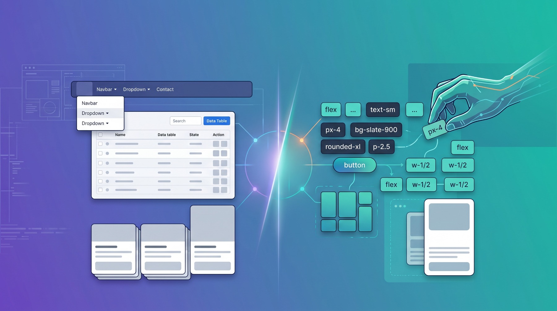
For over a decade, frontend styling felt like a solved problem: drop in Bootstrap, slap on a few col-md-6 and btn-primary classes, and ship your app. But the modern web landscape demands custom brand identities, fluid micro-interactions, and blazing-fast performance.
If you have spent your developer life in Bootstrap, you have likely felt the familiar friction: overriding default component styles with !important, battling opinionated CSS specificity cascades, and building applications that inevitably look like standard admin templates.
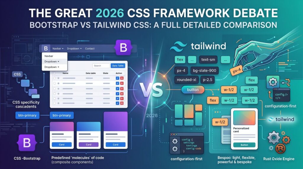
Here is an in-depth breakdown of how Bootstrap and Tailwind CSS compare in 2026, the arrival of the third major paradigm shift (shadcn/ui), and how your existing skills translate.
The Fundamental Philosophy Clash
The difference between Bootstrap and Tailwind isn’t just syntax; it is architectural philosophy:
HTML
<!-- Bootstrap: High-Level Component Abstraction -->
<button class="btn btn-primary btn-lg">Submit</button>

<!-- Tailwind: Low-Level Utility-First Primitives -->
<button class="rounded-xl bg-indigo-600 px-5 py-2.5 font-medium text-white shadow-sm transition hover:bg-indigo-500 active:scale-95">
  Submit
</button>
- Bootstrap is an Opinionated Component Library: It provides ready-to-use building blocks (cards, navbars, modals, alerts). You write minimal markup, but every button inherits Bootstrap’s rounded corners, shadows, and color ramps unless explicitly overridden.
- Tailwind is an Unopinionated Utility Engine: It does not provide pre-styled
<button>or<navbar>components. Instead, it provides atomic CSS classes (px-4,flex,text-sm) directly in your HTML, allowing you to design bespoke components without writing traditional custom CSS files.
In-Depth Breakdown
1. Customization & Brand Identity
- Bootstrap: Customization happens primarily through Sass variables (
$primary,$border-radius) and CSS Custom Properties (--bs-*). While Bootstrap 5 improved CSS variable support significantly, deeply diverging from standard Bootstrap visual aesthetics still requires fighting default component cascades. - Tailwind: With Tailwind v4, configuration is CSS-first (using native
@themedirectives and CSS variables). You build arbitrary gradients, 3D transforms, container queries, and sub-pixel micro-interactions inline without leaving your template. Two applications built in Tailwind rarely look alike.
2. Build Performance & Tooling
- Bootstrap: Minimal build setup required; you can link a single compiled CDN bundle and get started immediately. However, unused styles can result in unnecessary CSS payload unless actively purged via tools like PurgeCSS.
- Tailwind v4 (Oxide Engine): Tailwind v4 uses a high-performance Rust-based Oxide engine. Full builds run in milliseconds, incremental updates trigger in microseconds, and automatic content detection eliminates complex configuration files. It only compiles the exact CSS classes you use, producing tiny stylesheets (~10–20 KB in production).
3. Javascript & Interactive UI Components
- Bootstrap: Includes out-of-the-box Vanilla JavaScript plugins for modals, carousels, off-canvas drawers, tooltips, and dropdowns without needing a JavaScript framework.
- Tailwind: Provides zero JavaScript. If you want a modal to open or an accordion to collapse, you must implement the toggle logic yourself or pair Tailwind with headless libraries (e.g., Headless UI, Radix Primitives, or Alpine.js).
Head-to-Head Comparison
| Feature | Bootstrap 5 | Tailwind CSS v4 |
| Primary Paradigm | Pre-styled UI Components | Atomic Utility Classes |
| Design Flexibility | Moderate (prone to the “Bootstrap look”) | Infinite (complete creative control) |
| JS Components Included | Modals, Dropdowns, Tooltips, Toasts | None (styles only) |
| Build Engine | Sass / Precompiled CSS | Rust-based Oxide Engine |
| Config Approach | Sass variables & CSS custom properties | Native @theme CSS-first config |
| Bundle Size | Larger (~50–70 KB minified + JS) | Extremely lightweight (purged ~10–25 KB) |
| Learning Curve | Low (memorize component class names) | Moderate (learning shorthand utility tokens) |
The Learning Curve: Transitioning from Bootstrap to Tailwind
If you already know Bootstrap, you are not starting from scratch. Roughly 70% of your existing mental model directly translates to Tailwind. Both frameworks rely on pre-defined CSS classes inside HTML, use a mobile-first responsive methodology, and leverage shorthand conventions for spacing, alignment, and flexbox.
The primary difference lies in moving from component classes to atomic properties.
What Does “Atomic Properties” Actually Mean?
In chemistry, an atom is the smallest basic unit of matter that cannot be broken down further without losing its chemical identity.
In CSS architecture, an “Atomic Class” (or utility class) follows the exact same principle: one single class that does one single CSS job.
┌──────────────────────────────────────────────────────────────┐
│                    Bootstrap Approach                        │
│               (.btn = Composite Molecule)                    │
│                                                              │
│  .btn {                                                      │
│    display: inline-block;                                    │
│    padding: 0.375rem 0.75rem;                                │
│    border-radius: 0.375rem;                                  │
│    font-size: 1rem;                                          │
│    text-align: center;                                       │
│  }                                                           │
└──────────────────────────────┬───────────────────────────────┘
                               │
            Deconstructs into independent CSS atoms
                               │
                               ▼
┌──────────────────────────────────────────────────────────────┐
│                     Tailwind Approach                        │
│                   (Atomic Properties)                        │
│                                                              │
│   inline-block  ──►  display: inline-block;                  │
│   px-3 py-1.5   ──►  padding: 0.375rem 0.75rem;              │
│   rounded-md    ──►  border-radius: 0.375rem;                │
│   text-base     ──►  font-size: 1rem;                        │
│   text-center   ──►  text-align: center;                     │
└──────────────────────────────────────────────────────────────┘
- Bootstrap gives you “Molecules” (Pre-packaged Components): When you type
class="btn btn-primary", Bootstrap applies 15+ CSS rules at once behind the scenes (padding, border radius, background color, font weight, line height, transition). - Tailwind gives you “Atoms” (Individual Properties): There is no
.btnclass in Tailwind. You assemble the visual outcome yourself by stacking individual CSS rules directly onto the HTML tag.
Why Use Atomic Classes Instead of Pre-Packaged Ones?
When using a composite class like .btn-primary, if you want slightly thinner padding or a non-standard hover transition, you have to write custom CSS to override Bootstrap’s defaults.
With atomic classes, you never “fight” existing rules—you simply swap py-2 to py-1 or change hover:bg-blue-600 to hover:bg-indigo-500.
Direct Class-for-Class Translation Guide
| CSS Concept | Bootstrap 5 | Tailwind CSS | Key Takeaway |
| Spacing (Margin/Padding) | m-3, pt-4, px-2 | m-3, pt-4, px-2 | Identical syntax. Both use standard directional indicators (t, b, x, y). |
| Flexbox Layout | d-flex justify-content-between | flex justify-between | Tailwind uses concise standard CSS abbreviations. |
| Grid & Sizing | col-md-6 | md:w-1/2 or md:col-span-6 | Tailwind supports responsive widths via simple fractions (w-1/2, w-1/3). |
| Text Alignment | text-center, text-end | text-center, text-right | Direct standard CSS mapping. |
| Visibility / Display | d-none, d-block, d-grid | hidden, block, grid | Tailwind drops the d- prefix entirely. |
| Colors | bg-primary, text-danger | bg-blue-600, text-red-500 | Tailwind offers fine-grained numeric shades (50–950) rather than a few theme keywords. |
The Crucial Syntax Shift: Prefix-First Responsiveness
The biggest syntactic difference between the two frameworks is how responsive breakpoints are declared:
- Bootstrap embeds breakpoints in the middle of layout classes:HTML
<div class="col-12 col-md-6 col-lg-4"></div> - Tailwind uses conditional prefixes for all CSS properties:HTML
<div class="w-full md:w-1/2 lg:w-1/3"></div>
Because Tailwind uses a prefix model (md:, lg:, hover:, focus:), you can make any atomic property responsive or interactive on the fly:
HTML
<!-- Changes font size, padding, and layout across breakpoints -->
<div class="p-2 text-sm flex flex-col md:p-6 md:text-base md:flex-row">
  ...
</div>
Real-World Example: Refactoring a Bootstrap Card to Tailwind
Here is how a standard profile card translates from Bootstrap’s component-based classes to Tailwind’s atomic utility classes.
Markup Side-by-Side
HTML
<!-- Bootstrap 5: Component-Based Approach -->
<div class="card shadow-sm border-0">
  <img src="avatar.jpg" class="card-img-top" alt="Avatar">
  <div class="card-body text-center">
    <h5 class="card-title fw-bold">Sarah Jenkins</h5>
    <p class="card-text text-muted small">Lead Product Designer</p>
    <a href="#" class="btn btn-primary btn-sm w-100">View Profile</a>
  </div>
</div>
HTML
<!-- Tailwind CSS: Atomic Utility Approach -->
<div class="overflow-hidden rounded-xl bg-white shadow-sm border border-slate-100">
  <img src="avatar.jpg" class="h-48 w-full object-cover" alt="Avatar">
  <div class="p-5 text-center">
    <h3 class="text-base font-bold text-slate-900">Sarah Jenkins</h3>
    <p class="mt-1 text-sm text-slate-500">Lead Product Designer</p>
    <a href="#" class="mt-4 block w-full rounded-lg bg-indigo-600 px-3 py-2 text-sm font-semibold text-white transition hover:bg-indigo-500">
      View Profile
    </a>
  </div>
</div>
Atomic Class Breakdown
| Bootstrap Class | Tailwind Equivalent | What the Tailwind “Atoms” Do |
.card | rounded-xl bg-white border border-slate-100 | Replaces bundled card styles with explicit border radius, background, and border color. |
.card-img-top | h-48 w-full object-cover | Fixes image height, forces full width, and ensures the aspect ratio crops cleanly (object-fit: cover). |
.card-body | p-5 | Sets explicit padding (1.25rem / 20px) directly without needing a wrapper class. |
.card-title .fw-bold | text-base font-bold text-slate-900 | Sets font size, weight, and high-contrast text color individually. |
.text-muted .small | text-sm text-slate-500 mt-1 | Defines font size (0.875rem), muted color shade, and top margin. |
.btn .btn-primary .btn-sm | rounded-lg bg-indigo-600 px-3 py-2 text-sm font-semibold text-white transition hover:bg-indigo-500 | Assembles padding, corner radius, background, text color, and hover transition from individual atomic utilities. |
Who Uses What in Production?
Who Uses Bootstrap?
- Enterprise Admin Portals & Internal Dashboards: Internal tooling where custom branding is secondary to speed of delivery.
- Full-Stack Framework Defaults: Widely integrated in Django, Ruby on Rails, ASP.NET, and traditional backend-driven templates.
- Institutions & Legacy Platforms: Organizations like NASA, universities, and public sector platforms that prioritize long-term stability and familiar HTML layouts.
Who Uses Tailwind CSS?
- Modern SaaS & Tech Companies: OpenAI (ChatGPT interface), Shopify, GitHub documentation, Vercel, and Loom.
- Design-Forward Agencies & Startups: Teams that need bespoke UI systems, custom dark modes, smooth typography, and tailored animations.
The Third Popular Contender: shadcn/ui
If you are hesitating between Bootstrap’s pre-built convenience and Tailwind’s styling power, look at shadcn/ui (alongside alternatives like DaisyUI).
┌─────────────────────────────────────────────────────────┐
│                      shadcn/ui                          │
│  (Pre-built Accessible Logic + Tailwind Customization)   │
└────────────────────────────┬────────────────────────────┘
                             │
              ┌──────────────┴──────────────┐
              ▼                             ▼
       Tailwind CSS                  Radix Primitives
     (Visual Styling)             (Accessible JS Logic)
Instead of installing an npm package that locks you into a black-box component, shadcn/ui uses a CLI to copy accessible, pre-built components directly into your codebase styled with Tailwind. You get:
- Ready-made accessible dialogs, tabs, datatables, and dropdowns (like Bootstrap).
- Complete ownership of the code and Tailwind utility classes (avoiding Bootstrap’s stiffness).
Pros and Cons Summary
Bootstrap
- Pros:
- Ready-to-use interactive components without extra dependencies.
- Predictable, clean HTML without long strings of class names.
- Fast prototyping for backend developers who do not want to design from scratch.
- Cons:
- Difficult to break away from the default look.
- Overriding complex nested components often leads to CSS bloat.
- Slower to adapt to modern CSS primitives (container queries, subgrid, fluid typography).
Tailwind CSS
- Pros:
- Absolute freedom to craft distinct visual design systems.
- No naming fatigue (
.wrapper-inner-card-container). - Lightning-fast build times with dead-code elimination.
- Cons:
- HTML templates can become cluttered with class strings.
- Requires building or importing your own interactive component logic.
Which One Should You Choose?
- Stick with Bootstrap if: You build backend-heavy apps, internal dashboards, or quick proof-of-concepts where UI parity with a standard design system is acceptable and you want zero configuration.
- Switch to Tailwind CSS if: You are building customer-facing products, modern SaaS web apps, or applications where brand aesthetics, fluid responsive layouts, and fine-grained UI polish are critical.
- Take the Hybrid Path (Tailwind + shadcn/ui or DaisyUI) if: You love Bootstrap’s pre-packaged UI elements but want the modern design freedom of Tailwind.
